
The psychology of color in Home Remodeling: Creating Stunning Spaces
Welcome to our exploration of the psychology of color and its impact on interior design. When embarking on a remodeling project, the colors we choose play a role far beyond mere aesthetics. The psychology of color delves into how different hues influence our mood, emotions, and even behavior, making the selection of a color palette an essential aspect of any design process.
Understanding color theory is about more than picking shades that appeal to the eye; it’s also about creating an atmosphere that resonates with the emotions and needs of those who inhabit the space. Whether it’s the calming blues of a bedroom, the energizing yellows of a kitchen, or the balanced neutrals of a living room, each color carries its own weight and significance.
In this guide, we’ll navigate the complexities of choosing the right color palette for your remodel, ensuring every room looks stunning and feels right. We’ll explore the unique ways different colors transform spaces through the lens of color theory.
The psychology of color
The psychology of color is a fascinating aspect of design that delves into how different hues evoke various emotional responses and influence mood and behavior. Understanding the basics of color theory helps homeowners and designers make informed decisions about a remodel’s color palette.
Basics of color theory
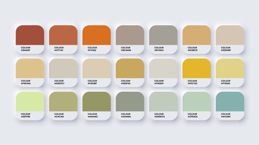
Color theory is a guideline for understanding the relationship between colors and their psychological effects. It encompasses the color wheel, color harmony, and the context in which colors are used. Colors are often categorized into primary, secondary, and tertiary. Understanding these categories helps in creating pleasing color combinations.
Emotional responses evoked by different colors
Each color evokes different emotions and feelings. While there are exceptions to the rule, there are some common trends. For example, blue is often associated with calm and serenity, making it a popular choice for bedrooms and bathrooms. Green is reminiscent of nature, promotes tranquility, and is ideal for living spaces or offices.
On the other hand, red, a color of passion and energy, stimulates appetite and conversation and is often used in dining areas and kitchens. Yellow, while associated with happiness and creativity, should be used sparingly, as it may also cause feelings of frustration in large amounts.
Color and room functionality
Choosing the right colors for your home goes beyond personal preferences; it’s about aligning hues with the function of each room to enhance its usability and ambiance. The colors you select impact a space’s perceived size, lighting, mood, and atmosphere.
Choosing colors based on room function
In the bedroom, where relaxation is key, soothing colors like soft blues, gentle greens, or warm neutrals create a serene environment conducive to rest.
For kitchens, where energy and cleanliness are important, consider brighter colors like whites or light yellows or stimulating shades like reds or oranges, which are known to enhance appetite and sociability.
Living rooms benefit from a balanced approach as areas for relaxation and socializing. Warm tones like beiges or grays create a welcoming feel while adding accents in bolder colors inject personality and vibrancy.
Color’s impact on perceived space size and room lighting
Lighter colors make rooms feel larger and more open, reflecting more light and giving an airy feel. Darker colors, while cozy, make a space feel smaller and more intimate. When dealing with smaller rooms or those with limited natural light, opt for lighter shades to maximize the sense of space and brightness.
Tips for balancing bold colors with neutral tones
Introducing bold colors into your home is exciting, but balancing them with neutral tones is important to avoid overwhelming the space. Use bold colors as accents — through wall art, cushions, or a feature wall — rather than the primary color scheme.
This approach allows flexibility in changing the room’s look over time and ensures that the bold colors enhance rather than dominate the space. Neutral backgrounds provide a canvas for these pops of color, creating a harmonious yet dynamic environment.
By considering the function of each room, the impact of color on space and lighting, and balancing bold and neutral tones, you can create a home that is aesthetically pleasing and functionally suited to your lifestyle.
Trends versus timelessness in color selection
In the ever-evolving world of home design, the choice between embracing current color trends and opting for timeless hues is a crucial decision. Understanding the difference between these two approaches is key to creating a space that reflects your style and stands the test of time.
Pros and cons of following current color trends
Following current color trends invigorates your home with a modern and stylish look. It allows you to experiment with bold and unique color combinations, giving your space a distinct personality. However, the downside is the risk of your decor feeling dated as trends evolve, possibly necessitating more frequent updates.
Timeless color choices, on the other hand, are classic and enduring. These hues, such as neutrals or subtle shades, have a lasting appeal and are less likely to go out of style. They provide a versatile backdrop you can easily update with accessories or accents as trends change.
Choosing a color palette that remains appealing over time
To choose a color palette that remains appealing over time, consider blending trendy and timeless elements.
Start with a foundation of classic colors for walls and large furniture pieces. These neutral tones are a versatile canvas that can adapt to changing styles. Then, incorporate trendy colors through easily changeable elements like cushions, wall art, or small decor items.
This approach allows you to refresh your space with new trends without committing to a complete overhaul, ensuring your home remains stylish and enduringly appealing.
Personalizing your color palette
Personalizing your color palette is essential in making your home truly yours. Customize your palette to reflect your unique style and preferences while still considering the principles of color psychology to create a harmonious and comfortable environment. Here are some tips to help you infuse your personality into your color choices.
Incorporating personal style and preferences
Your color choices should resonate with your personal aesthetic and the mood you want to create in your home.
Start by identifying colors that you are naturally drawn to. Do you prefer bold and vibrant hues, or are you more inclined towards soft and muted tones? Use these preferences as a starting point.
If you have a favorite piece of art, a cherished heirloom, or even a beloved wardrobe piece, draw inspiration from these items. Their colors can serve as a guide for your palette.
Balancing personal taste with color psychology principles
While personal preference is important, balancing these choices with color psychology principles ensures your space is stylish, comfortable, and conducive to your intended use of each room. For instance, you might love the color red, but using it extensively in a bedroom might get in the way of relaxation. Instead, use it as an accent color to energize spaces like the kitchen or dining area.
Incorporating accent colors for character and uniqueness
Accent colors are a fantastic way to add character and uniqueness to your space without overwhelming it. Choose one or two bold colors that complement your primary palette and use them in small doses throughout your home.
This could be through decorative pillows, throws, artwork, or even a feature wall. These pops of color will add depth and interest to your rooms, showcasing your personality in a subtle yet impactful way.
Aim to create a space that feels like an extension of yourself. By thoughtfully incorporating your personal style with the principles of color psychology and using accent colors to add uniqueness, you create a deeply personal and beautifully cohesive home.
Practical considerations in color selection
Practical considerations are as important as aesthetic appeal when selecting colors for your home. Durability and maintenance are key factors, especially in high-traffic areas or spaces prone to wear and tear. Opt for high-quality paints with a finish suitable for your lifestyle; for instance, washable or scrubbable paints are ideal for spaces like kitchens and children’s rooms.
Lighting plays a role in how colors are perceived. Natural light can dramatically alter the appearance of a color throughout the day, while artificial lighting may enhance or mute certain tones. Consider the orientation of your rooms and the type of light they receive when choosing your colors.
Finally, always test your color choices before committing. Paint swatches on large sections of your walls and observe them at different times of the day and under various lighting conditions. This step ensures the color you choose looks as intended in the actual environment.
Home renovations with Renovate Ease
Understanding the psychology of color is an excellent tool for creating a home that looks beautiful and feels right. As you embark on your remodeling journey, remember that color choices are deeply personal yet profoundly impactful.
If you’re looking for expert guidance in bringing your vision to life, look no further than Renovate Ease. Setting the benchmark in remodeling and restoration, Renovate Ease combines expertise with a keen understanding of design aesthetics to transform your space.
We invite you to experience the difference with us for your home remodeling needs. Contact Renovate Ease today, and let’s create a space that resonates with your style and color preferences.